

- Role
- Frontend Architect & Angular Developer
- Year
- 2026
- Platform
- Angular applications
- Status
- In progress — planning stage
Overview
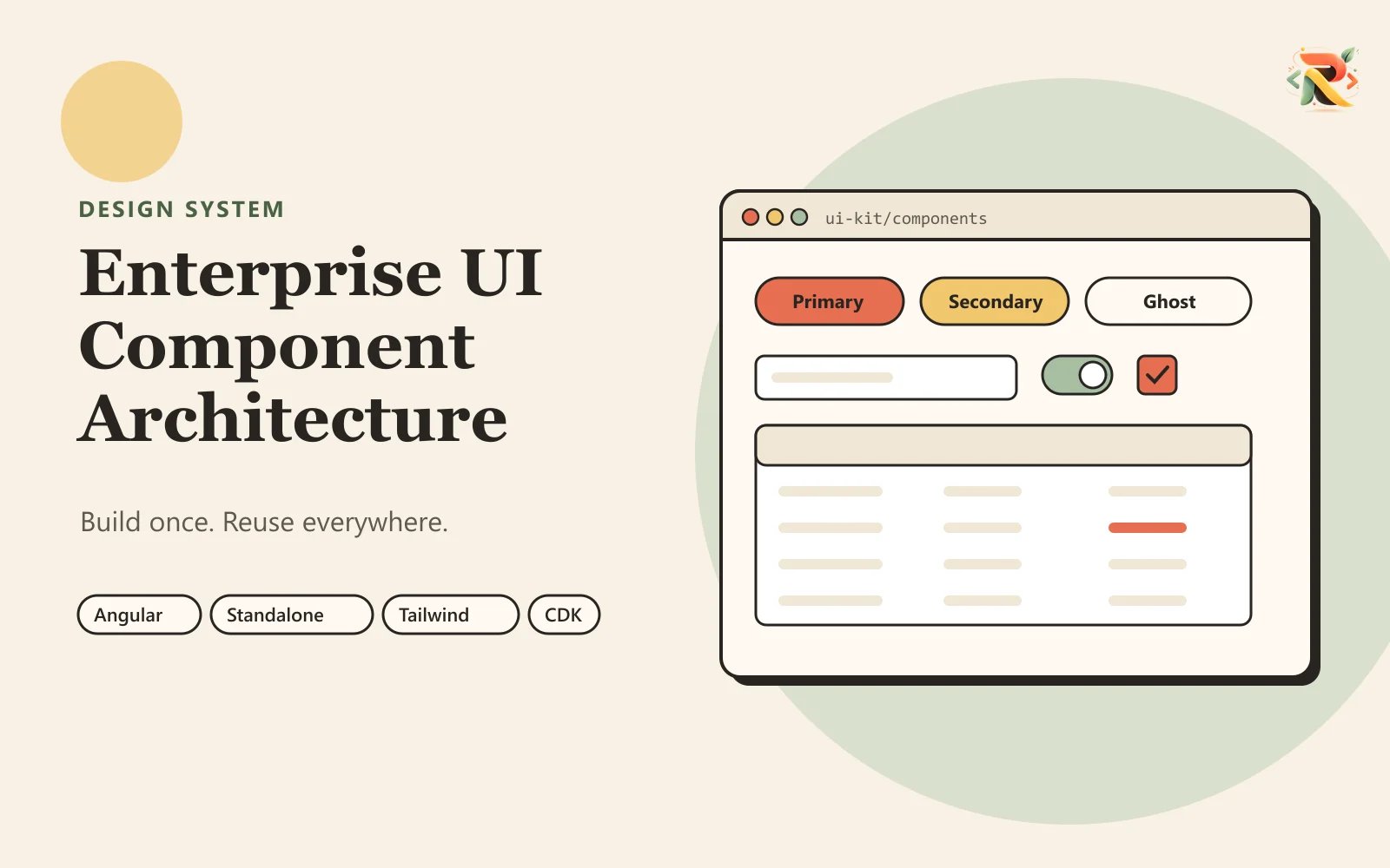
Reusable Angular UI architecture designed to provide a shared foundation for forms, inputs, layouts, tables, dialogs, navigation and other enterprise application patterns.
The challenge
Large applications often develop duplicated UI patterns, inconsistent interactions and difficult-to-maintain components as multiple teams build features independently.
Reusable components must remain flexible enough for different business requirements without becoming overly complex or tightly coupled to individual applications.
The solution
A reusable Angular component architecture focused on consistency, composability, accessibility, scalable APIs and predictable design patterns across enterprise applications.
Standalone Angular components with reusable APIs, Signals for reactive state, Angular CDK capabilities where required and Tailwind CSS for consistent design tokens and styling patterns.
Key features
Reusable Angular components
Form controls
Input components
Buttons and actions
Tables and data views
Dialogs and overlays
Layout components
Navigation patterns
Design tokens
Accessibility patterns
Engineering decisions
- Problem
- Shared components fail in two opposite directions — too rigid and teams work around them, too configurable and they become harder to use than writing the markup directly.
- Decision
- Standalone components with small, composable APIs and Signals for reactive state, rather than large components with wide option surfaces.
- Why
- Composition lets a team assemble the variant they need from parts that each stay simple, which keeps flexibility without pushing every new requirement into another boolean input.
- Trade-off
- Composable parts mean more pieces to learn and more assembly at the call site than a single component that tries to do everything.
- Problem
- Interaction behaviour — focus management, overlays, keyboard handling — is the part teams most often reimplement slightly differently and slightly wrong.
- Decision
- Angular CDK primitives underneath the component layer wherever that behaviour is needed, rather than hand-rolled implementations per component.
- Why
- These are solved problems with accessibility requirements attached, and a bespoke version is usually a subtly inaccessible version.
- Trade-off
- It ties the component layer to CDK conventions and adds a dependency that has to be upgraded in step with Angular.
Stack
| Components | Standalone Angular components |
|---|---|
| Reactivity | Signals |
| Primitives | Angular CDK |
| Styling | Tailwind CSS design tokens |
Results
- Planned: a reusable UI foundation for enterprise Angular applications.
- Planned: standardise frequently used interface patterns to reduce duplication.
- Planned: a scalable approach to keeping application experiences consistent.
Where to go next
- frontend architecture consulting — the service this project is evidence for.
Related case studies
Delivered
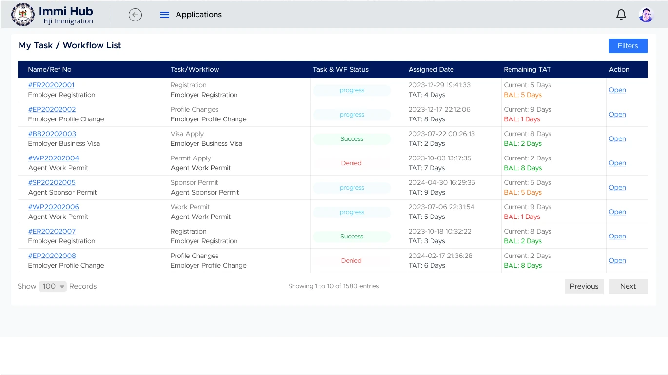
Fiji Immigration Internal Management System
The system immigration officers run a country borders on.